UI Implementation Techniques
Adjusting Interface Size
Manually Adjusting Control Sizes and Positions
In any given program, it's best practice for all controls of the same type to maintain a consistent style and uniform size. This principle is particularly important for a set of identical controls on the same interface, which should appear uniform.
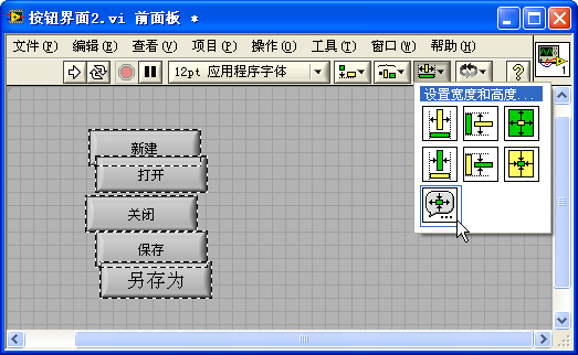
Below is the front panel of a VI, showcasing a set of buttons. To keep the interface looking clean, these buttons should have uniform sizes, be arranged orderly, and utilize the same font type.
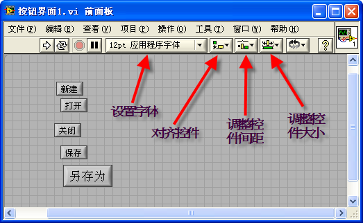
LabVIEW offers a suite of tools for organizing the positions and sizes of interface controls. These tools, found on the VI's toolbar, include "Text Settings", "Align Objects", "Distribute Objects", and "Resize Objects". The figure above highlights the main functions of these tool buttons. The font adjustment button allows for modifications to the font, size, color, and alignment of interface text. The four adjacent tools are designed for aligning controls, adjusting control spacing, resizing controls, and altering the stacking order of controls.
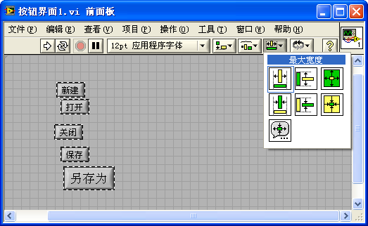
To standardize the size of buttons on the interface, first select all the controls, then click the appropriate "Resize Objects" tool button as needed. For example, the "Match Maximum Width" button sets all selected controls to the width of the widest control:
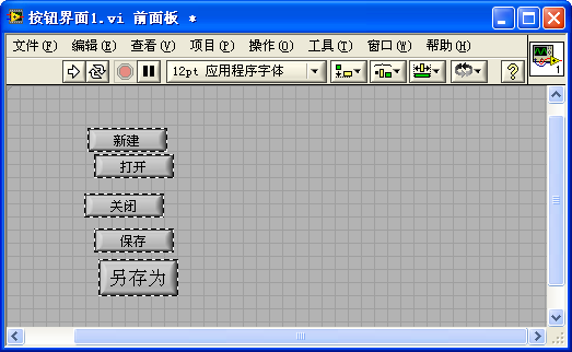
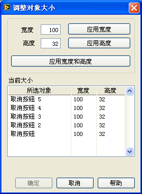
Alternatively, you can select all controls and use the "Set Width and Height" button. This opens a dialog box where specific control dimensions can be entered:
The application of the other toolbar tools follows a similar methodology to that used for resizing controls, so further explanation is omitted here.
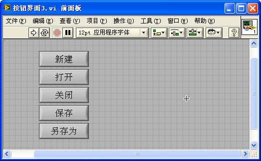
Utilize the tools for adjusting control positions, spacing, and the font adjustment tool to organize the controls neatly. An interface with orderly arranged controls is significantly more visually appealing:
Designing Interfaces with Adjustable Sizes
What should be the size of a program's interface? If a program is intended for use by multiple users, it's likely to be displayed on screens of varying resolutions. An interface that's too large might not fully fit on low-resolution screens, while one that's too small could underutilize the space on high-resolution displays. Ideally, from a user perspective, the size of a program's interface should be adjustable, allowing users to adapt it to any size that fits their computer screen best. To ensure a cohesive display, as the size of the interface changes, the sizes and positions of the controls on the interface must adjust accordingly.
Controls can adapt to interface size changes in two ways. First, there are controls whose sizes also need to be adjusted: large data display controls such as waveform displays, tables, or large text boxes, which usually serve as the interface's main components, need their sizes adjusted to maximize the display area. On the other hand, some controls can remain a fixed size, like buttons and checkboxes. Although their sizes don't need to change with the interface, their positions might need adjusting to achieve the best layout.
Panes and Splitter Bars
Typically, each VI has a front panel, which can be composed of multiple panes. By default, a new VI's front panel consists of a single pane. Since most panels only have one pane, the presence of panes often goes unnoticed. However, it's important to recognize that in LabVIEW, controls are placed on panes, not directly on the front panel; it's the panes that are positioned on the front panel.
Splitter bars can be used to divide the front panel into additional panes. These bars are located in the control palette under [some Style] -> Containers. Splitter bars come in horizontal and vertical types, allowing the front panel to be split in various directions. Regardless of which pane a control is placed in, it only changes the interface's appearance and does not affect the program's functionality.
When the front panel's size changes, the splitter bar can also move accordingly. The "Adjust Splitter" option in the splitter bar's right-click menu allows setting whether the splitter bar moves with a specific edge of the panel or moves proportionally:
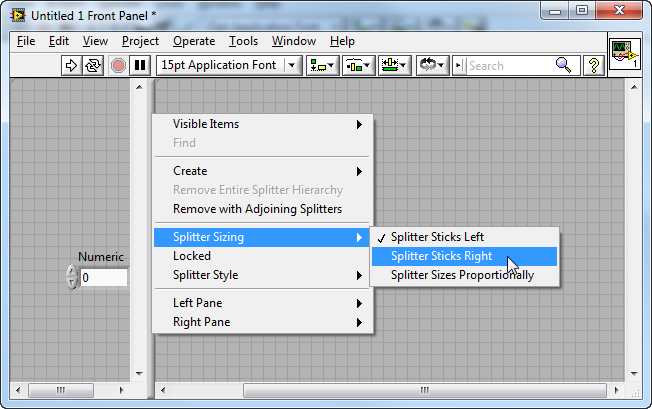
The "Left Pane" and "Right Pane" (or "Top Pane" and "Bottom Pane") options at the end of the splitter bar's right-click menu are for setting properties of the panes on either side of the splitter. For instance, after dividing the interface into panes, you usually won't need scroll bars within those panes, so you can disable them from showing in the submenu.
The properties of the splitter bar can also be set through programming during runtime. Although the splitter bar does not have connector terminals like controls do on the block diagram, you can create its reference, property nodes, and invoke nodes via the right-click menu and use its properties and methods within the program. For example, the small program shown here adjusts the position of the splitter bar from the previous figure from left to right.
During program execution, users can still manually move the splitter bar on the interface. If you wish to prevent users from changing the position of the splitter bar, you can select "Lock" from the splitter bar's right-click menu, thereby locking its position.
The splitter bar does not possess a hide property. If you want to make the splitter bar invisible during program execution, you can do so by changing its color. First, switch the style of the splitter bar to "Classic", then color it the same as the program's background, rendering the splitter bar invisible when the program runs. It's also worth noting that the panes on either side of the splitter bar can have different background colors.
Similarly, panes do not have a hide property. If you need to hide a specific pane during program execution, you can adjust the surrounding splitter bars' positions to effectively collapse the pane.
Programmatically Adjusting Control Positions and Sizes
When running a program, a viable method to adjust the interface size is by dynamically modifying the sizes and positions of the controls. This adjustment becomes necessary when the program detects a "Pane Size" event, prompting it to recompute each control's position and size based on the new dimensions of the interface.
For example, consider a program interface that includes a waveform chart control and a stop button:
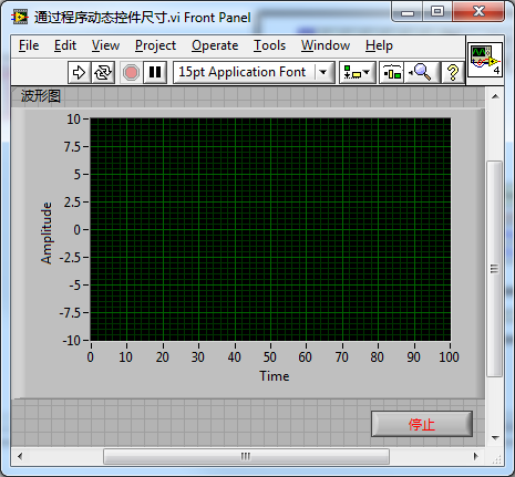
The goal when the user resizes the interface is to have the stop button consistently docked at the bottom right corner, while the waveform chart control expands to occupy the remaining interface space. These changes can be programmatically implemented, as demonstrated in the example program below:
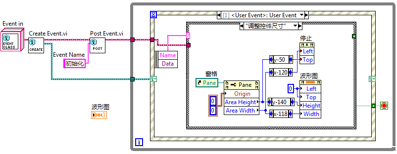
Whenever there's a change in interface size, the program reads the current width and height of the interface anew and calculates the appropriate positions and sizes for each control. In the depicted program, the layout adjustment code is placed in a "Resize Controls" user event branch, rather than dealing with it directly in the "Pane Size" event branch. This approach is taken because the program may need to adjust the interface layout at multiple points, such as during both initialization and when a "Pane Size" event occurs. The solution involves placing the layout adjustment code within the "Resize Controls" user event branch and triggering a "Resize Controls" event upon program initialization or when a "Pane Size" event happens, directing the program to adjust the layout in this branch. This strategy prevents the need for duplicating layout adjustment code across multiple sections of the program.
Programming control layouts to adapt to changing interface sizes ensures precise and stable adjustments. For specific controls, such as gauge controls, programming is the only way to adjust their size accurately. The drawback is that these adjustments can be cumbersome. For simpler interfaces, using splitter bars to facilitate layout organization can eliminate the need for complex programming.
Proportionally Scaling All Controls
For programs with a simple interface that includes only one pane, you can opt for "Scale all objects with window size" in the VI's properties. This setting ensures that when the interface size changes, all controls adjust their sizes proportionately:
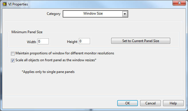
With this setting enabled, the entire interface scales proportionally, and all controls resize simultaneously. However, this method of scaling lacks precision. After several adjustments to the interface size and a return to the original dimensions, some control sizes may slightly differ from their initial state. This discrepancy occurs because both the front panel and controls' sizes are integer-based, leading to a shift in their size ratio after each adjustment. Thus, each resizing introduces a small error, which can significantly accumulate over time.
Scaling Only One Main Control
In many program interfaces, it might be sufficient to have just one control capable of scaling to fill the screen, with no need to resize other controls as long as they maintain a tidy layout.
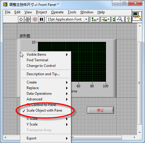
For interfaces consisting of a waveform chart control and a stop button control, for example, it may only be necessary for the waveform chart to adjust with the interface size. This adjustment can be achieved by selecting the "Scale with pane" property from the control's right-click menu. Note, however, that each pane allows only one set of controls to be configured to "Scale with pane".
Controls set to this property are demarcated with dark outline lines. When the interface is resized, the distance from these outline lines to the nearest edge of the VI front panel stays constant, only the size of the rectangle enclosed by these lines changes with the interface. This method ensures the main control adjusts with the interface size, while the positions of other controls remain fixed.
If there are multiple primary controls, such as two waveform controls of equal importance on the interface, they can simply be grouped together. A group of controls behaves similarly to a single control in terms of layout and appearance. By setting this group to "Scale with pane", all controls within it can adjust together with changes in interface size.
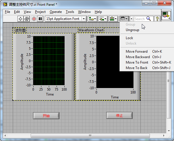
When the interface size varies, as seen in the "Start" and "Stop" buttons example, the distance between them also changes due to their positions near the interface edges. To keep the relative distance between these buttons constant, they can be grouped together as well.
Adjusting Control Positions and Sizes Using Splitter Bars
For complex interfaces, splitter bars alone can be utilized to adjust the sizes and positions of controls. Consider an interface like the one below, which is composed of multiple controls:
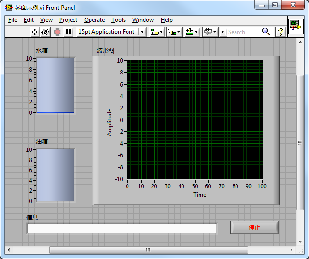
This interface includes five controls with specific requirements: the water tank, oil tank, and waveform chart need to adjust proportionally to the interface size. However, the distance between these three controls, as well as their distance from the interface borders, should remain unchanged. The information box's length should adjust with the interface, but its height should stay the same. The stop button's size is constant, always located at the interface's bottom right corner.
To position each control, splitter bars can be employed. For ease of adjusting control sizes during editing and ensuring accuracy after multiple adjustments of interface size, several splitter bars can be set up. The goal is to provide each resizable control with a pane that can fully expand. Then, by selecting "Scale object with pane" from the control's right-click menu, their sizes will always match the pane size.
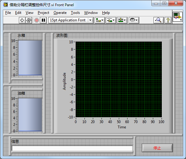
The water tank, oil tank, waveform chart, and information box should all be set to fill their respective panes. The stop button, being a fixed size, does not require this setting.
This example is an extreme case. Typically, it's unnecessary to use so many splitter bars, as long as you ensure each pane contains only one control that adjusts with the interface.
The variance in how controls on the interface change is determined by the splitter bars' alignment settings. The image below illustrates the alignment settings for the splitter bars:
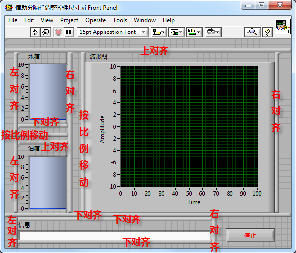
Actually, users might prefer not to have splitter bars visible on the interface. You can hide them by following the methods outlined in the section on Panes and Splitter Bars.
Key Points for Programmatically Adjusting UI Sizes
- Some Controls Are Non-resizable - In LabVIEW, not all controls are designed to have adjustable sizes. Most fixed-size controls are intended for subVI input/output parameters and are typically not used on user interfaces. However, there are exceptions, especially with system-style controls like the radio buttons and checkboxes illustrated below, which cannot be resized.
- Certain Controls Require a Fixed Aspect Ratio - Most LabVIEW controls allow you to set their height and width independently. Yet, some controls, such as gauges and knobs depicted below, have a fixed circular shape, necessitating a constant one-to-one aspect ratio.
For these controls, options like "Scale object with pane" or "Fit control to pane" are not viable because LabVIEW's automatic adjustment for these control sizes lacks precision. Therefore, these controls must be resized using programming methods.
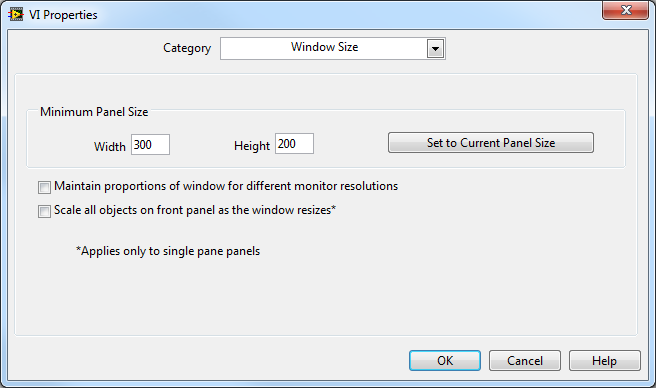
- Minimum Interface Size - When adjusting the layout, it’s advisable to establish a minimum size for the interface. Since controls cannot be reduced to infinitely small sizes, excessively shrinking the entire interface serves no practical purpose for users. The front panel's minimum size, essentially the program's minimum interface size, can be configured in the VI's property dialog:
Implementing an Application Exit Button
The VI main panel window in LabVIEW features a red cross at the top right, designed for closing the VI window. Despite this built-in close button, it’s still essential to include a button labeled "Cancel", "Exit", or "Close" on the program interface. This design aligns with the familiar layout of dialog boxes in both Windows systems and LabVIEW, which all include buttons for exiting or closing the dialog. Typically, users instinctively look for a button on the interface to close the dialog box.
Additionally, it's crucial to properly handle cases where users click the red cross to close the interface. Some may assume that closing the window should also halt the VI's code execution, but that is not automatically the case. Dialog boxes that pop up in an application are usually subVIs of the application. Clicking the red cross closes the VI's front panel but does not remove the subVI from memory nor stops the VI from running. If the VI contains looping structures, it could continue to run for an extended period or indefinitely if it cannot meet the loop's stopping condition (for example, if stopping the loop requires clicking a certain button on the dialog box, which becomes inaccessible once the interface is closed), until the computer is shut down. I have encountered VIs where clicking the dialog box's close window button (red cross) causes the VI program to freeze, illustrating the problem.
Interface programs, typically written using event structures, have a specific "Close Front Panel" event in the <This VI> event source. Handling this event in the program is vital. The diagram below shows the event handling code for when users click the stop button on the interface or the close window button. The program includes pre-exit tasks, interface closure, and program termination.
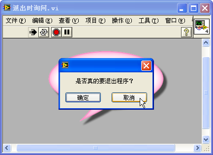
In some programs, carelessly closing a panel or dialog box might lead to serious issues. Therefore, when a user clicks the title bar's close window button, the program should display a confirmation prompt. The program should only close after the user confirms their intention to exit, preventing more significant problems from accidental actions.
This functionality can be achieved using the "Panel Close?" filter event:
Upon clicking the red cross, a dialog box first appears asking the user for confirmation. Only after the user confirms by clicking, does the program officially close:
Menus
When running a VI, the main panel menu bar by default shows LabVIEW's standard menus. These menus might not serve any purpose for specific LabVIEW applications, as programs often need their own customized menu items.
Creating a program's own menu is quite straightforward in LabVIEW, thanks to the specialized menu editor it provides. Accessing the menu editor is as simple as selecting "Edit -> Run-Time Menu" from the VI's interface menu, enabling the creation of a "Custom" menu:
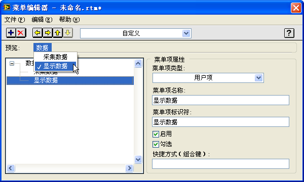
The menu editor interface is intuitive. With the guidance of the interface's menus, toolbars, and the help documentation, readers can easily craft the desired custom menus.
After finalizing and saving the custom menu, running the interface VI again will show the newly created custom menu on the interface:
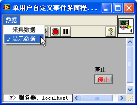
Creating the menu is just the first step; you must also implement the code to respond to menu actions within the program. Clicking a custom menu item triggers a "Menu Activation?" event in LabVIEW; selecting an item from the custom menu generates a "Menu Selection (User)" event. These menu-related events are located under the <This VI> event source. By capturing this event in the program's event structure, you can then append the appropriate code. For instance, the program illustrated below toggles the checkmark next to the "Display Data" menu item.
Menu functions can be found in the "Programming -> Dialog & User Interface -> Menu" subpalette.
Control Shortcut Menus
During the execution of a program, right-clicking a control will pop up LabVIEW's default control shortcut menu:
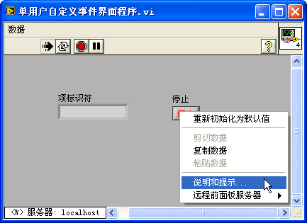
This shortcut menu often may not suit the needs of an application, necessitating the setup of a custom right-click menu for the control. By selecting "Advanced -> Run-Time Shortcut Menu -> Edit" from the control's right-click menu, the "Shortcut Menu Editor" will appear. Editing this menu is similar to modifying the interface's menu bar. After saving the menu and running the VI, right-clicking the control will display the custom shortcut menu. Similarly, code must be written within the "Shortcut Menu Activation?" and "Shortcut Menu Selection (User)" event cases to implement its functionality.
In the example above, we set up a pop-up menu for the "Stop" button on the interface, featuring a single item "Change Color". Each time this menu item is clicked, the button changes its display color:
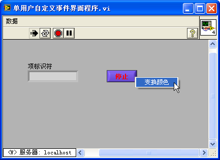
An important consideration when programming control right-click menu events is that the menu reference in the "Shortcut Menu Activation?" event case is only valid within that case.
Keyboard Interface Operation
While the mouse is the primary tool for navigating program interfaces, it's crucial to accommodate users who prefer keyboard controls. Designing program interfaces to ensure that all controls are accessible via keyboard shortcuts caters to varied user preferences.
A common keyboard operation is using the Tab key to switch focus among interface controls. Focus should transition between controls in a left-to-right, top-to-bottom sequence. This sequence can be modified through "Edit -> Set Tabbing Order". Confirm or cancel the newly selected order by clicking the check (√) or cross (×) button.
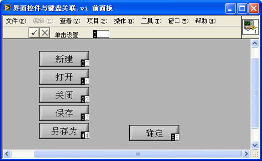
To exclude a control from being selected with the Tab key, the option "Skip This Control When Tabbing" can be selected on the "Key Navigation" tab in the control's properties dialog.
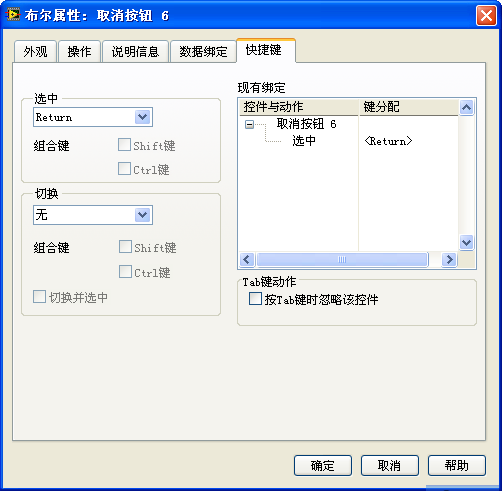
For special controls frequently used in interface operations, such as "OK", "Cancel", or "Exit" buttons, dedicated selection or toggle keyboard shortcuts can be assigned. This setting is found on the "Key Navigation" tab in the control's properties dialog:
Composite Controls
Complex controls often consist of simpler components.
Controls in LabVIEW vs. Controls in WPF
The approach to combining simple controls into complex ones varies across programming languages, each with its strengths and weaknesses. Here's a look at how LabVIEW and WPF tackle this task.
WPF (Windows Presentation Foundation) represents a modern framework for crafting user interfaces in .NET. Microsoft's vision with WPF aimed to segregate the user interface from the application logic. This division allows designers to focus on the UI while programmers concentrate on the backend functionality. WPF employs XAML (Extensible Application Markup Language), a text-based language akin to XML, for its UI design. This XAML code is then compiled into .NET's intermediate language during the build process, drawing a parallel to LabVIEW's method of separating the interface from code.
LabVIEW provides a direct and intuitive interface design process. However, WPF seems to be a work in progress, especially in visual editing capabilities. A major challenge is that Visual Studio's interface editor often fails to render complex UIs, losing the essence of visual editing. In a current project involving over a hundred XAML files, about 70% cannot be visually displayed in the editor, necessitating manual text adjustments. These modifications can only be validated by executing the program.
Moreover, UIs seldom remain static; elements typically change in response to data dynamics during program execution. Thus, some WPF controls must be data-bound within the program. Unlike WPF, LabVIEW permits controls to possess data even in edit mode, enabling developers to preview the runtime state of controls while designing. WPF, on the other hand, lacks this feature as controls do not hold data in edit mode. This leads to a disparity between the UI appearance in the editor and its actual presentation during runtime.
LabVIEW and WPF, each targeting distinct audiences, approach the provision of interface controls in fundamentally different ways. WPF, designed for general programming and used by professional developers, focuses on offering powerful functionality and flexible programming options. It doesn't include an extensive array of built-in interface controls. However, it allows programmers to easily combine basic controls to create various interface styles and fulfill complex functions. On the other hand, LabVIEW, historically rooted in the measurement and control sectors, caters to a broad base of non-professional programmers by prioritizing ease of use. It comes equipped with a wide array of ready-to-use controls, each with a limited set of modifiable properties. While using these controls is straightforward—just drag and drop them onto the VI's front panel—creating a control that LabVIEW doesn't provide can be quite challenging.
As LabVIEW's applications have expanded far beyond its initial scope, a significant number of its users are now professional programmers who demand higher functionality and flexibility. To address these demands, recent versions of LabVIEW have introduced improvements such as project management capabilities and support for object-oriented programming. XControls were specifically designed to address the limitations and lack of flexibility in LabVIEW's native controls. However, XControls are notably complex, especially when compared to the more streamlined mechanisms of WPF.
WPF's approach to controls is almost entirely container-based. A button in WPF, for example, provides merely the framework and related methods and events for interaction. To add an image or text to the button, developers can embed image or text box controls within it, respectively. This ability to nest controls offers a level of customization and functionality that is difficult to achieve in LabVIEW. In LabVIEW, aside from a few exceptions, controls cannot be nested, which limits the ability to combine functionalities directly within a single control.
Consider the example of a table control that requires two columns, with buttons in the first column and dropdown boxes in the second. Implementing this in WPF is straightforward, thanks to the ability to embed controls within the table control directly. In contrast, achieving this in LabVIEW—where direct embedding is not an option—would require programmatically managing the positioning of buttons and dropdown boxes on the interface to simulate their inclusion in a list box. This approach is inherently more complex than WPF's direct embedding.
LabVIEW does offer some controls that share WPF's container-based nature, such as the tab control, which allows for the flexible placement of various controls on its pages for combined use.
Combining List Box and Dropdown Menu Controls
In this section, we'll explore how to create functionality akin to composite controls in a program by strategically moving controls.
Tables are ubiquitous in user interfaces, and this example focuses on limiting user input in a table column to a predefined set of options. This goal is achieved by overlaying a dropdown menu list control over a cell when it's selected, thus ensuring user inputs are confined to the allowed options and preventing incorrect entries. Imagine a program interface with a table whose second column requires user input, limited to selections of "A", "B", "C", or "D". When a user clicks on a cell within this column, the cell appears to transform into a dropdown menu list control, offering these selections for input.
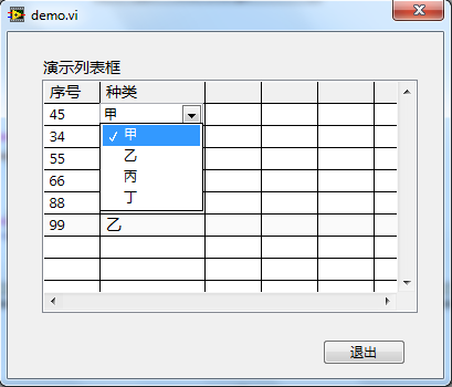
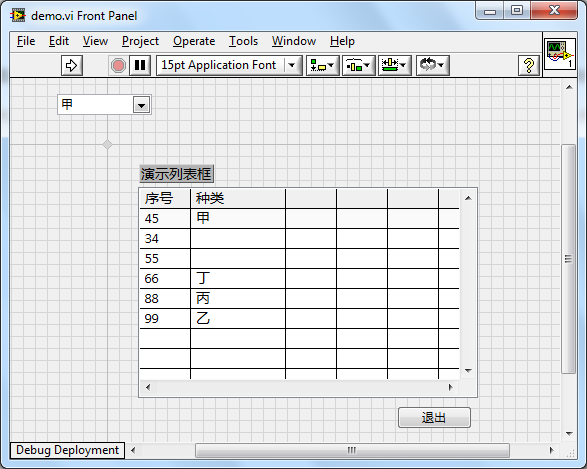
Achieving this effect requires combining two controls: a "List Box" control and a "Dropdown Menu List" control, as depicted in the interface below.
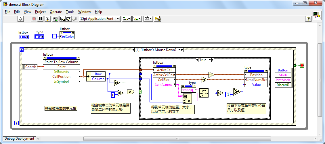
The program needs to monitor the "Mouse Down?" event on the list box control. If a user clicks within the list box, the program first determines if the click was within the second column ("Type" column). If so, it adjusts the dropdown menu list control to match the size of the clicked cell and moves it to cover the clicked cell, effectively making it appear as though the cell has turned into a dropdown menu list control. This approach is detailed in the program snippet below:
Should a user select a value from the dropdown list, that value is then assigned to the cell, and the dropdown control is moved out of the visible area:
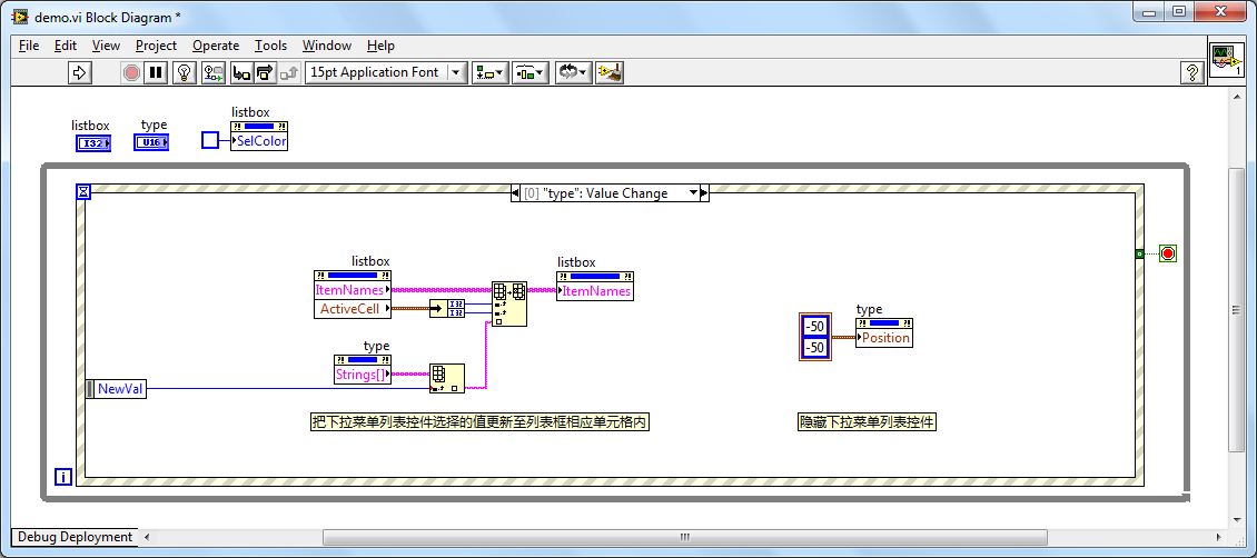
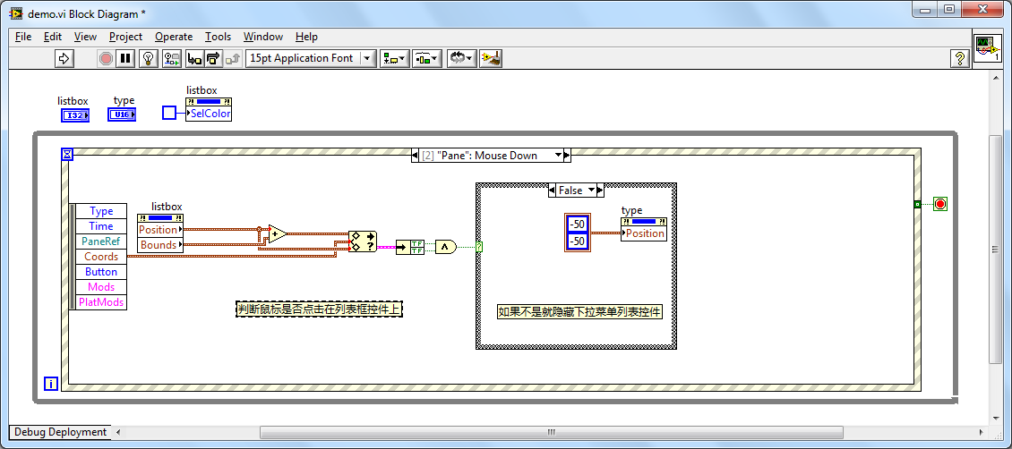
The program also needs to account for when to hide the dropdown menu list control. For instance, when the user clicks on another column or outside the list box altogether, the dropdown list control should be concealed:
